
Project overview
Project overview
Project overview
Reev Energy Hub & UX Restructuring was a comprehensive modernization initiative focused on transforming a seven-year-old energy management platform into a scalable, user-centered product ecosystem. The project involved a complete redesign of the platform experience, including the redevelopment of the design system, establishment of consistent UI and UX standards, integration of AI in process, optimization of core user workflows, and modernization of the overall product architecture
Reev Energy Hub & UX Restructuring was a comprehensive modernization initiative focused on transforming a seven-year-old energy management platform into a scalable, user-centered product ecosystem. The project involved a complete redesign of the platform experience, including the redevelopment of the design system, establishment of consistent UI and UX standards, integration of AI in process, optimization of core user workflows, and modernization of the overall product architecture
Reev Energy Hub & UX Restructuring was a comprehensive modernization initiative focused on transforming a seven-year-old energy management platform into a scalable, user-centered product ecosystem. The project involved a complete redesign of the platform experience, including the redevelopment of the design system, establishment of consistent UI and UX standards, integration of AI in process, optimization of core user workflows, and modernization of the overall product architecture
Project type:
Project type:
UX/UI restructuring
UX/UI restructuring
Duration:
Duration:
4 months
4 months
My Role:
My Role:
UX & UI Designer
UX & UI Designer
Responsibilities:
Responsibilities:
• Support UX research
• Support UX research
• AI integration
• AI integration
• Design systems
• Design systems
• Conceptualization
• Conceptualization
• UI Design & handoff
• UI Design & handoff
Why the need for restructuring ?
Why the need for restructuring ?
The seven-year-old B2B SasS platform had accumulated inconsistent user experiences, fragmented design patterns, and outdated workflows due to multiple freelance designers working on it without a proper design system. This hindered usability, scalability, and efficient product development. Also, the functionality was separated into various products offered by reev which needed to be consolidated into a single product going forward.
The seven-year-old B2B SasS platform had accumulated inconsistent user experiences, fragmented design patterns, and outdated workflows due to multiple freelance designers working on it without a proper design system. This hindered usability, scalability, and efficient product development. Also, the functionality was separated into various products offered by reev which needed to be consolidated into a single product going forward.
The seven-year-old B2B SasS platform had accumulated inconsistent user experiences, fragmented design patterns, and outdated workflows due to multiple freelance designers working on it without a proper design system. This hindered usability, scalability, and efficient product development. Also, the functionality was separated into various products offered by reev which needed to be consolidated into a single product going forward.
Vision for restructuring
Vision for restructuring
Vision for restructuring
The goal was to improve the overall product experience by eliminating UX inconsistencies, simplifying key user workflows, and creating a scalable design ecosystem that could support future product development, business growth, and evolving user needs.
Alongside the UX restructuring, we refreshed the visual language with a cleaner and more modern interface. The new direction used white space, brighter neutral tones, and a lighter visual hierarchy to make the product feel more open, intuitive, and easier to navigate.
The goal was to improve the overall product experience by eliminating UX inconsistencies, simplifying key user workflows, and creating a scalable design ecosystem that could support future product development, business growth, and evolving user needs.
Alongside the UX restructuring, we refreshed the visual language with a cleaner and more modern interface. The new direction used white space, brighter neutral tones, and a lighter visual hierarchy to make the product feel more open, intuitive, and easier to navigate.
The goal was to improve the overall product experience by eliminating UX inconsistencies, simplifying key user workflows, and creating a scalable design ecosystem that could support future product development, business growth, and evolving user needs.
Alongside the UX restructuring, we refreshed the visual language with a cleaner and more modern interface. The new direction used white space, brighter neutral tones, and a lighter visual hierarchy to make the product feel more open, intuitive, and easier to navigate.
Vision for Energy hub
Vision for Energy hub
Vision for Energy hub
To unify the companion application, B2B SaaS portal, and energy management capabilities into one integrated platform—enabling customers across Europe to manage energy more intelligently, simplify day-to-day operations, and transition seamlessly to a single, connected product experience.
To unify the companion application, B2B SaaS portal, and energy management capabilities into one integrated platform—enabling customers across Europe to manage energy more intelligently, simplify day-to-day operations, and transition seamlessly to a single, connected product experience.
To unify the companion application, B2B SaaS portal, and energy management capabilities into one integrated platform—enabling customers across Europe to manage energy more intelligently, simplify day-to-day operations, and transition seamlessly to a single, connected product experience.
Understanding the current experience
Understanding the current experience
Understanding the current experience
Started by auditing the existing product experiences instead of immediately redesigning individual screens.
The objective was to understand where inconsistencies existed, why they had occurred, and which issues were affecting both users and the development team.
Started by auditing the existing product experiences instead of immediately redesigning individual screens.
The objective was to understand where inconsistencies existed, why they had occurred, and which issues were affecting both users and the development team.
Started by auditing the existing product experiences instead of immediately redesigning individual screens.
The objective was to understand where inconsistencies existed, why they had occurred, and which issues were affecting both users and the development team.
UX audit observations
UX audit observations
UX audit observations
A few key observations from the UX audit:
A few key observations from the UX audit:
A few key observations from the UX audit:
Behavioral insights were not always connected directly to design decisions.
Behavioral insights were not always connected directly to design decisions.
Behavioral insights were not always connected directly to design decisions.
Spacing, hierarchy, and layout structures varied across screens.
Spacing, hierarchy, and layout structures varied across screens.
Spacing, hierarchy, and layout structures varied across screens.
Designers recreated common UI elements instead of reusing them.
Designers recreated common UI elements instead of reusing them.
Designers recreated common UI elements instead of reusing them.
Similar actions were represented using different components.
Similar actions were represented using different components.
Similar actions were represented using different components.
Components did not always include complete interaction states.
Components did not always include complete interaction states.
Components did not always include complete interaction states.
Defining the new design direction
Defining the new design direction
Defining the new design direction
Before creating components, I established a set of principles to guide the restructuring.
Before creating components, I established a set of principles to guide the restructuring.
Before creating components, I established a set of principles to guide the restructuring.
Consistency over one-off solutions
Consistency over one-off solutions
Consistency over one-off solutions
Reusable before custom
Reusable before custom
Reusable before custom
Brand expression with usability
Brand expression with usability
Brand expression with usability
Decision decisions driven and supported by behavioral data from Post hog
Decision decisions driven and supported by behavioral data from Post hog
Decision decisions driven and supported by behavioral data from Post hog
Building the Design Library and AI integration
Building the Design Library and AI integration
Building the Design Library and AI integration
A scalable design system structured on atomic design principles, enabling consistent and reusable UI components across all levels of the product—from foundational elements to fully realized pages.
A scalable design system structured on atomic design principles, enabling consistent and reusable UI components across all levels of the product—from foundational elements to fully realized pages.
A scalable design system structured on atomic design principles, enabling consistent and reusable UI components across all levels of the product—from foundational elements to fully realized pages.
The new components, variables and styles ✨
The new components, variables and styles ✨
The new components, variables and styles ✨
A few of our new hand-crafted components and its variants.
A few of our new hand-crafted components and its variants in playgroud.
A few of our new hand-crafted components and its variants.
Buttons
Buttons

Tables
Tables

Checkbox/Radio buttons/ Switches
Checkbox/Radio buttons/ Switches

Input fields
Input fields

Badges
Badges

Search component
Search component

Variables, styles and colors that were included in the design library:
Variables, styles and colors that were included in the design library:
Variables, styles and colors that were included in the design library:
Standardized foundational design tokens for spacing, padding, opacity, breakpoints, and other responsive properties.
Standardized foundational design tokens for spacing, padding, opacity, breakpoints, and other responsive properties.
Standardized foundational design tokens for spacing, padding, opacity, breakpoints, and other responsive properties.
WCGA compatible color system with 17 shades across 11 semantic color groups.
WCGA compatible color system with 17 shades across 11 semantic color groups.
WCGA compatible color system with 17 shades across 11 semantic color groups.
A comprehensive typography system using Roobert, consisting of 45 foundational styles and five custom product styles.
A comprehensive typography system using Roobert, consisting of 45 foundational styles and five custom product styles.
A comprehensive typography system using Roobert, consisting of 45 foundational styles and five custom product styles.
Established a consistent iconography system using open-source Google Material Icons.
Established a consistent iconography system using open-source Google Material Icons.
Established a consistent iconography system using open-source Google Material Icons.
AI integration with Claude design
AI integration with Claude design
AI integration with Claude design
To accelerate early-stage design exploration, I created a Claude Design library using key components, colors, and variables from Reev’s design system. This allowed the team to transform initial sketches, wireframes, and approved content into high-fidelity concepts that could be used for feedback, stakeholder discussions, and rapid iteration.
Claude Design was introduced as an intermediate step rather than a replacement for Figma. AI-generated screens provided a strong visual starting point, while final designs were manually refined to ensure accurate component usage, brand consistency, accessibility, and pixel-perfect developer handoff.
To accelerate early-stage design exploration, I created a Claude Design library using key components, colors, and variables from Reev’s design system. This allowed the team to transform initial sketches, wireframes, and approved content into high-fidelity concepts that could be used for feedback, stakeholder discussions, and rapid iteration.
Claude Design was introduced as an intermediate step rather than a replacement for Figma. AI-generated screens provided a strong visual starting point, while final designs were manually refined to ensure accurate component usage, brand consistency, accessibility, and pixel-perfect developer handoff.
To accelerate early-stage design exploration, I created a Claude Design library using key components, colors, and variables from Reev’s design system. This allowed the team to transform initial sketches, wireframes, and approved content into high-fidelity concepts that could be used for feedback, stakeholder discussions, and rapid iteration.
Claude Design was introduced as an intermediate step rather than a replacement for Figma. AI-generated screens provided a strong visual starting point, while final designs were manually refined to ensure accurate component usage, brand consistency, accessibility, and pixel-perfect developer handoff.
Workflow :
Workflow :
Sketches and requirements → Claude Design prototype → Team feedback → Figma refinement → Developer-ready design
Sketches and requirements → Claude Design prototype → Team feedback → Figma refinement → Developer-ready design
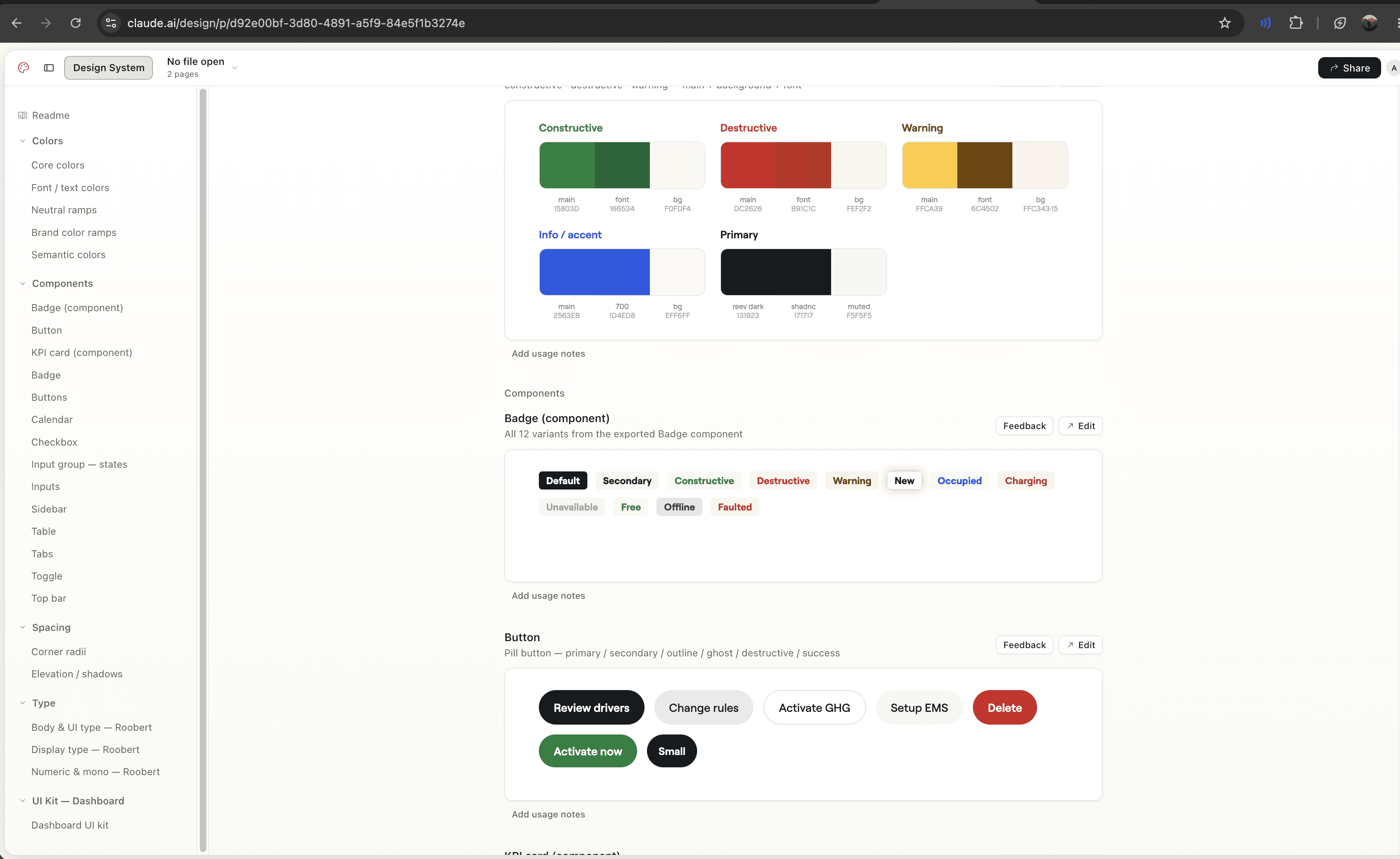
The Claude design library
The Claude design library
The Claude design library

A sample outcome using it
A sample outcome using it
A sample outcome using it
The design library in action
The design library in action
The design library in action
Few of our energy hub high-fidelity iterations and versions using the new design library
Few of our energy hub high-fidelity iterations and versions using the new design library
Few of our energy hub high-fidelity iterations and versions using the new design library


